
Most public disagreement about climate change is really disagreement about models: what a simulation says the world looks like in 2060, how much warming a given emissions pathway produces, whether past projections ran warm or cool. Those are legitimate arguments and worth having carefully.
But they sit downstream of a different question, and the two are routinely confused. The climate change evidence that the planet is warming, and that the warming is caused by burning fossil carbon, does not come from models. It comes from instruments: thermometers, infrared gas analysers, mass spectrometers, autonomous ocean floats, satellite radar altimeters, and pairs of satellites that measure the distance between themselves precisely enough to weigh an ice sheet. Models are built afterwards, to explain those measurements. Switch every climate model off tomorrow and the observational record is unchanged.
This page walks through that record line by line: what is measured, which instrument measures it, who operates it, and how uncertain the answer is.
The surface temperature record
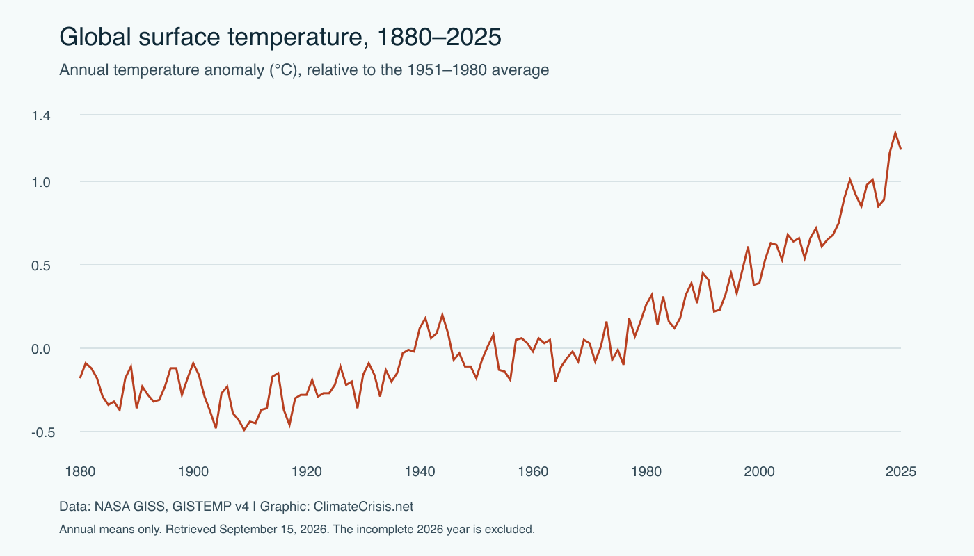
Direct thermometer measurements of air and sea surface temperature extend back to about 1850, with sparse coverage before that. The raw material is millions of individual readings from land weather stations, ships and, since the 1990s, moored and drifting buoys.
Turning that into a single global average is not trivial. Stations move, instruments change, cities grow up around thermometers that once sat in fields, and ships shifted from canvas buckets hauled over the side to water drawn through engine intakes. Each introduces a bias that has to be identified and corrected.
What makes the result credible is that several teams have done this work separately. NASA’s Goddard Institute for Space Studies produces GISTEMP; NOAA produces NOAAGlobalTemp; the UK Met Office Hadley Centre and the University of East Anglia produce HadCRUT5; Berkeley Earth was established as an independent reanalysis by a group that included researchers publicly sceptical of the existing records; and Copernicus, run by ECMWF, produces ERA5, which is not a station average at all but a reanalysis blending observations with atmospheric physics.
Different methods, same answer
These groups make different choices at almost every step — how to fill gaps in the Arctic, how to correct sea surface data, which stations to include, whether to interpolate at all. They arrive in the same place. All show roughly 1.3 to 1.5°C of warming since the late nineteenth century, and all put 2025 at approximately 1.43°C above the pre-industrial baseline, among the three warmest years on record, reached without an El Niño to push it there.
Stated uncertainty on the recent global annual mean is a few hundredths of a degree. For the 1850s it is closer to a tenth of a degree, because there were far fewer thermometers. Neither figure is large enough to change the conclusion.
The carbon record

This is the part of the climate change evidence that is least often explained properly, and it is the strongest single line of argument.
Since 1958, atmospheric CO2 has been measured continuously at Mauna Loa Observatory in Hawaii — the Keeling curve, now maintained by Scripps Institution of Oceanography alongside NOAA’s own programme. The instrument is a non-dispersive infrared gas analyser, calibrated against reference gas mixtures of known composition. Its precision is around a tenth of a part per million, far finer than the annual signal it records. Concentrations reached 425.6 ppm in 2025.
For the period before instruments, the record comes from ice. Snow falling on Antarctica and Greenland traps air, which is sealed into bubbles as the snow compacts, so a drilled core yields a direct sample of ancient atmosphere. Law Dome cores give near-decadal resolution across the industrial period and overlap the Mauna Loa record, where the two agree. The EPICA Dome C core reaches back roughly 800,000 years, across which CO2 oscillated between about 180 and 300 ppm. The pre-industrial level was around 278 ppm, making the present concentration a 53% increase.
The isotopic fingerprint
Rising CO2 on its own does not identify the source. Two independent measurements do.
Carbon comes in a heavier isotope, carbon-13, and a lighter one, carbon-12. Photosynthesis discriminates against the heavier one, so plant matter — and therefore coal, oil and gas, which are ancient plant matter — is depleted in carbon-13 relative to the atmosphere. Mass spectrometers show the atmospheric ratio of carbon-13 to carbon-12 falling steadily as CO2 rises. The added carbon carries a plant signature. Volcanic CO2 does not.
The second fingerprint is oxygen. Combustion consumes O2 and produces CO2. Scripps has measured atmospheric oxygen at extremely high precision since 1989, and it is declining in close to the ratio combustion chemistry predicts. This distinguishes burning from ocean outgassing, because a warming ocean releasing CO2 would add carbon without removing any oxygen. It is not doing so — the ocean is absorbing carbon, which is why its surface is becoming measurably more acidic.
Three separate instrument types, measuring three separate quantities, all identify the additional carbon as fossil in origin.
Ocean heat content
Surface air temperature is what people feel, but it is a poor measure of how much energy the planet is accumulating. Air has very little heat capacity. Water has a great deal, and the oceans have absorbed almost 90% of the excess energy trapped in the Earth system over the past half century.
Since the mid-2000s this has been measured by Argo, an international array of roughly 4,000 autonomous floats distributed across the global ocean. Each drifts at depth, rises to the surface every ten days while recording temperature and salinity from 2,000 metres up, transmits by satellite and sinks again. Deep Argo floats extend the same measurement to 6,000 metres. The temperature sensors resolve thousandths of a degree.
Ocean heat content is far less noisy than surface temperature. El Niño and La Niña move heat between ocean and atmosphere, which makes any individual year’s surface figure jump around; the ocean’s total energy content simply integrates the imbalance, and its curve rises almost monotonically. 2025 was the warmest year on record for global ocean heat content. Before Argo the record relies on ship-deployed expendable bathythermographs, which needed correction for a known descent-rate bias and carry wider uncertainty.
The cryosphere

Arctic sea ice has been monitored by passive microwave satellites since 1979, a continuous 47-year record. Ice and open water emit microwaves very differently, so extent can be retrieved regardless of cloud or darkness. In 2025 the Arctic maximum extent was the lowest in that record, while the September minimum was eleventh lowest — a reminder that individual years are weather-influenced and the trend matters more than any single figure.
Ice age tells a clearer story than extent, as thick multi-year ice is progressively replaced by thin seasonal ice. Only about 95,000 km² of ice older than four years remained in September 2025, against roughly 1.5 million km² in the 1980s. The Arctic is warming at about three times the global average rate; 2025 was its second-warmest year in a 126-year record.
The ice sheets are weighed rather than photographed. The GRACE mission (2002–2017) and its successor GRACE-FO measure the separation between two satellites in the same orbit. Passing over a heavier region tugs the leading satellite forwards first, changing that separation by microns. Greenland and Antarctica are both losing mass, and two entirely different methods — satellite altimetry from CryoSat-2 and ICESat-2, and mass budgeting from snowfall minus outlet glacier discharge — reconcile with the gravity result. Mountain glaciers are tracked by direct field measurement through the World Glacier Monitoring Service, whose global reference network has recorded a net annual loss every year since the late 1980s.
Sea level
Two instruments, measuring differently. Tide gauges have recorded coastal sea level at some ports since the nineteenth century, but they measure sea level relative to land that is itself rising or subsiding, so they require GPS correction. Since 1993, satellite radar altimeters — TOPEX/Poseidon, the Jason series, now Sentinel-6 Michael Freilich — have measured the distance to the sea surface across the open ocean, independent of land motion.
Global mean sea level reached a record high for the fourteenth consecutive year, about 111.2 mm above the 1993 average. The long-term rate is around 3.5 mm per year and accelerating.
The important result is that the budget closes. Since 2005, thermal expansion contributes 1.6 ± 0.3 mm per year, measured by Argo. Ice sheets and glaciers contribute 2.0 ± 0.4 mm per year, measured by satellite gravimetry. Those sum to roughly 3.6 mm per year, which matches what the altimeters observe, within uncertainty and after accounting for smaller terms such as changes in land water storage. The total and its components are measured by completely different instruments. That they agree is a direct test of whether the underlying physics is understood, and it passes.
Why independent agreement matters
The epistemological point is worth stating plainly. These are not variations on one measurement. They are different physical quantities, measured by different instrument types, processed by different teams in different countries under different funding arrangements, each with its own failure modes.
A thermometer network can be wrong through station relocation or urban encroachment. A satellite altimeter can be wrong through orbit determination error or ionospheric delay. A gravimetry mission can be wrong through accelerometer drift or an imperfect model of post-glacial rebound. A mass spectrometer can be wrong through calibration drift. None of these error sources has anything to do with any of the others.
For the conclusion to be false, every one of these systems would have to be wrong, in the same direction, by a similar amount, across five decades and dozens of institutions. No mechanism for that has ever been proposed. The simpler explanation is the one the instruments give.
What remains genuinely uncertain
Being clear about this strengthens the case rather than weakening it, because it separates what has been measured from what is projected.
Climate sensitivity. How much warming eventually results from doubling CO2 is not precisely known. The IPCC’s Sixth Assessment Report gives a best estimate of 3°C, a likely range of 2.5 to 4°C, and a very likely range of 2 to 5°C. That range is narrower than earlier assessments but it is still a range, and it matters a great deal at the top and bottom.
Aerosol forcing. Particulate pollution reflects sunlight and alters cloud properties, offsetting some greenhouse warming. AR6 assesses this effect at about −1.3 W/m², very likely between −2.0 and −0.6 W/m². It remains the largest uncertainty in the present-day energy balance, and it is the reason cleaning up air pollution has a warming side effect that is hard to quantify precisely.
Regional precipitation. Global temperature is far better constrained than regional rainfall. In many regions even the sign of the change in mean precipitation is unsettled, though changes in extremes are better understood.
Ice sheet dynamics and timing. How fast marine-terminating parts of the West Antarctic Ice Sheet can retreat, and whether particular instability mechanisms operate at all, remains an open research question, and it affects the upper end of sea level projections beyond this century considerably.
What is not uncertain: that CO2 has risen by 53%, that the added carbon is fossil in origin, that the Earth system is accumulating energy, and that the ocean, the ice and the sea surface all record it. Energy production accounts for roughly two-thirds of global greenhouse gas emissions, which is where the measurements point any response.